
American Beauty Restaurants
American Beauty Restaurants includes two related concepts, American Beauty Bistro and American Beauty The Restaurant. The existing logos remained in place, but the broader visual presence needed a more intentional and consistent direction across customer touchpoints.
My Role:
I developed a refreshed visual language through typography, layout, color, imagery, and recurring graphic treatments, then carried that direction across menus, social media, and print.
My Approach:
The logos were already established, but the broader visual identity was open to development. Using the client's vision for the atmosphere of each restaurant, I built a new visual language through typography, color, imagery, texture, and layout, giving each concept its own personality while keeping them connected as part of American Beauty.
Deliverables
The Bistro
The menu system brings the visual identity into one of the brand’s most functional touchpoints, using typography, spacing, and hierarchy to organize dense information while keeping the experience distinctly branded.

Menus


Social Media
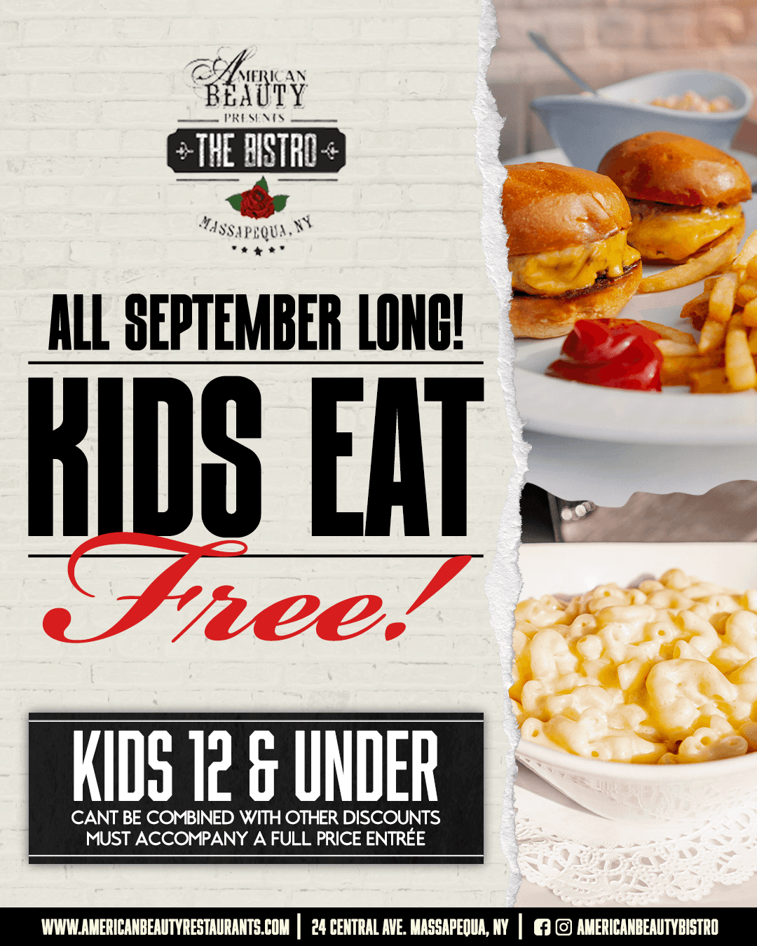
Social content extends the same visual language into a more flexible promotional system, allowing food, events, and offers to change without losing brand recognition.




Print Material
Print collateral carries the system into physical customer touchpoints while maintaining the same typography, hierarchy, and overall visual tone.


The Restaurant

For The Restaurant, the system was adapted to support a distinct concept while maintaining a visual relationship with the broader American Beauty brand.
Menus


Newspaper
I adapted the restaurant’s visual system for newspaper advertising, balancing brand personality with the need to communicate offers, events, and details quickly. Clear hierarchy and restrained layouts helped the work stay recognizable without becoming crowded.


Social Media
Campaign graphics translate that identity into repeatable digital content designed to remain recognizable across changing promotions and imagery.


Next work
